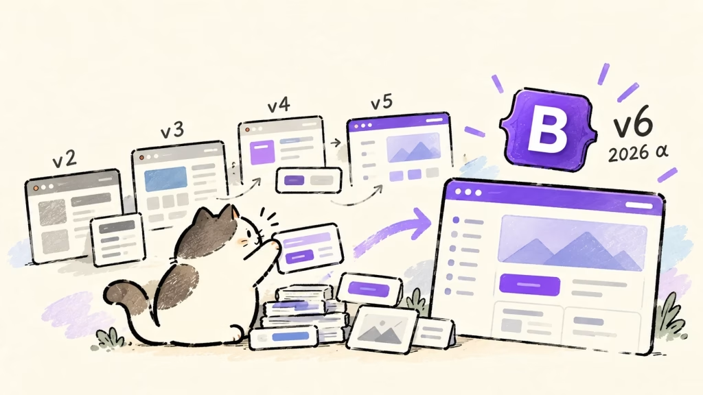
Work on Bootstrap's next major version, v6, is progressing, and its first alpha was released in October 2026.
The changes point in a somewhat different direction: more CSS custom properties and more reliance on features built into modern browsers.
Bootstrap, after all, changed how many of us built websites.
There was a time when you could look at a page and immediately think, "Ah, that's Bootstrap."
I remember seeing it seemingly everywhere, especially in the days of Twitter Bootstrap v2 and v3.
I was amazed when I first tried it.
I could copy sample code from the official documentation and get a page that looked reasonably polished.
Was making a decent-looking website really this easy?
Looking back, that experience may have shaped some of my approach to web development.
With v6 on the horizon, it's a good moment to revisit what Bootstrap brought to web development—and how its role has changed over the past 15 years.
Making Consistent, Decent-Looking UI Accessible
Bootstrap was released in 2011, drawing on a UI toolkit developed inside Twitter.
At the time, keeping buttons, form fields, spacing, and navigation consistent often meant accumulating project-specific CSS.
Bootstrap supplied a coordinated visual language, components, a grid system, and examples.
Instead of designing every element from scratch, you could assemble a fairly coherent interface with markup borrowed from the docs.
CSS frameworks existed before Bootstrap, of course.
What made it stand out to me was how it packaged not just layout, but a broad set of the interface elements that real services needed, with an approachable way to use them.
There was a trade-off.
As more sites adopted it, the same colors and components kept turning up, producing the recognizable "Bootstrap look"—sometimes affectionately, sometimes critically called the "Bootstrap smell."
But getting a usable page up quickly was valuable.
Design quality no longer had to depend entirely on an individual's visual instincts.
v1–v3: From Desktop Consistency to Mobile-First Design
| Version | Year | Defining change | The challenge it reflected |
|---|---|---|---|
| v1 | 2011 | Shared UI components and grid | Inconsistent interfaces and implementations |
| v2 | 2012 | Responsive layout support | Supporting both desktop and mobile screens |
| v3 | 2013 | Mobile-first, flatter design | Treating mobile as the default, not an exception |
v1: First, Make the Interface Consistent
The original Bootstrap made it possible to avoid building every UI element from zero.
Designers and developers could assemble screens using the same parts and conventions.
That value hasn't disappeared.
The point was not merely to create one attractive button; it was to maintain consistency across a page and make the next screen easier to build.
That practical benefit is an important part of Bootstrap's legacy.
v2: Responsive Design as an Option
Bootstrap v2 introduced responsive layout support in 2012.
Initially, it was optional: a separate stylesheet enabled the responsive behavior.
That distinction captures the period rather well.
The desktop site was still the starting point, with mobile adjustments added afterward.
It may feel roundabout today, but it reflected a real transitional moment in web development.
v3: Mobile-First Becomes the Default
In 2013, v3 reversed that relationship.
Its guiding phrase was "Mobile first and always responsive."
Mobile-first, responsive styling became the default instead of something enabled with an additional stylesheet.
The visual language also moved away from pronounced gradients and dimensional effects toward a flatter appearance.
Panels, list groups, and other components helped developers assemble interfaces for the smartphone era.
For me, v2 and v3 were when Bootstrap felt most ubiquitous.
That's a recollection from the sites and development work I encountered, not a claim that usage statistics peaked in those versions.
The interesting shift is that responsive design went from an option in v2 to the default in v3.
When a technique changes from "nice to have" to "taken for granted," the structure of a framework changes with it.
v4: More Freedom to Compose and Customize
Bootstrap v4 arrived in 2018 with a Flexbox-based grid and greater use of Sass for customization.
It also consolidated earlier patterns such as panels, wells, and thumbnails into a more flexible card component.
Versions 1–3 were appealing because they made it easy to start with a consistent interface.
Version 4 offered more freedom to adapt those shared building blocks to a project's own design.
It felt like a move from getting a ready-made look toward creating distinctive layouts with common tools.
Utility classes expanded, making it easier to adjust spacing and alignment without writing new CSS.
The other side of that convenience was increasingly long lists of classes in HTML.
Should a framework provide finished components or small pieces that developers assemble themselves?
That tension remains relevant today.
v5: Leaving jQuery and Internet Explorer Behind
Two of the most significant changes in Bootstrap v5, released in 2021, were removing its jQuery dependency and dropping Internet Explorer support.
Its JavaScript relied on native browser APIs, and CSS custom properties became increasingly prominent.
If v4 expanded how much developers could customize, v5 was partly about deciding what the framework would no longer carry forward.
Rather than keep supporting older browser constraints, it could build on modern browser capabilities.
That decision helps explain the further embrace of native CSS and UI elements in v6.
Of course, the trade-off is real for sites with existing users.
A business application that still needs an older browser cannot necessarily upgrade immediately.
Embracing web standards and supporting deployed systems are both part of the decision.
v6: Letting the Browser Do More of the Work
Bootstrap 6 Alpha 1 was announced on October 8, 2026.
It's still in development, but its broad direction is already apparent.
| Change | Difference from v5 | Why it matters |
|---|---|---|
| CSS properties and tokens | Moves more visual customization from Sass to CSS | Easier to adjust styles without recompiling |
| Native CSS | Uses @layer, oklch(), light-dark(), and more | Less need to recreate browser capabilities |
| Components | Leans on elements such as <dialog> and <details> | More behavior handled by the browser |
| Layout | Adds container queries | Responsive decisions can depend on a component's container |
| Class syntax | Shifts forms such as .col-lg-6 toward .lg:col-6 | More consistent responsive and state prefixes |
| JavaScript | ESM-only distribution and TypeScript source | Designed around modern tooling |
Sass isn't disappearing.
The idea is to use it where generation and structure are useful, while leaning on CSS custom properties for design tokens such as colors and spacing.
Native elements also do not make Bootstrap's component abstractions irrelevant.
The browser requirements are moving forward too: Chrome and Edge 130, Firefox 132, and Safari 18 are the stated minimum versions.
The project does not plan to supply fallbacks for older browsers.
For existing sites, that makes browser support, class-name changes, and breaking JavaScript changes important migration considerations.
These details describe Alpha 1 and may change before the stable release.
One other sign of the times: v6 includes documentation for LLMs and Skills intended to assist migration.
Bootstrap once helped people build pages by copying HTML examples; now it's also making its conventions legible to coding agents.
What We Ask Frameworks to Do Has Changed
Responsive support was optional in v2 and default in v3.
Version 5 left jQuery and Internet Explorer behind, while v6 aims to delegate even more CSS and interface behavior to the browser.
Across those releases, Bootstrap's role has shifted from filling gaps in what browsers could easily do to helping developers compose consistent designs using native capabilities.
My own recent projects have involved centralizing values in CSS custom properties, revisiting support for old browsers, and removing unnecessary bespoke implementations.
Perhaps that's why the v6 plans feel so familiar.
That doesn't mean everyone needs a more comprehensive framework.
Bootstrap continues to develop as a broad design system, while lightweight options such as PicoCSS or BeerCSS may be a better fit for smaller projects.
As browsers become more capable, developers gain more freedom to choose only the layers they need.
What surprised me about Bootstrap years ago was that I didn't have to build everything myself to make a respectable page.
Fifteen years later, the underlying goal may not have changed much:
Use good tools that already exist, and spend your time on what you actually want to build.
The difference is that more of those good tools now live in the browser itself.






Comments